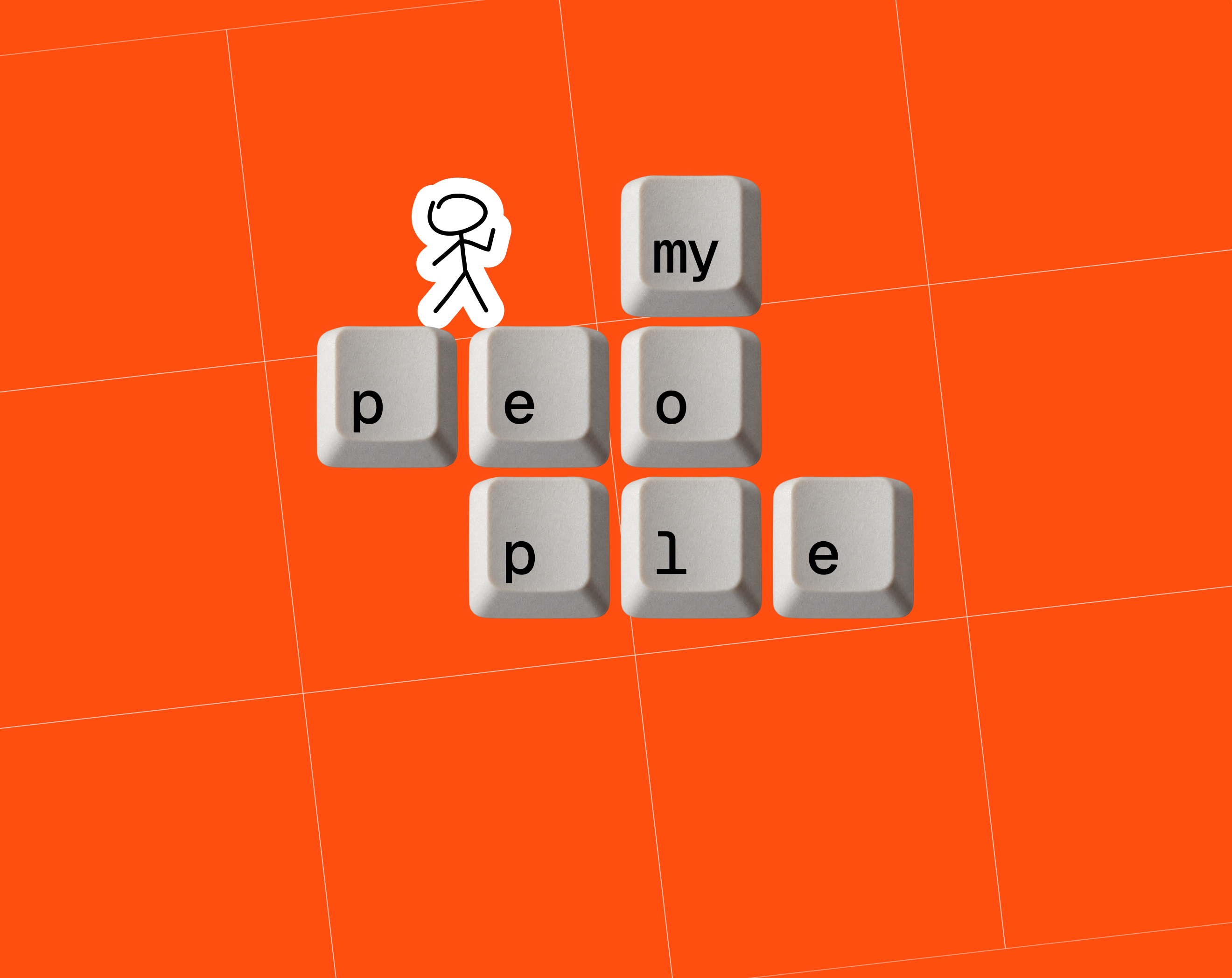
One of Us From Day One: JATAPP’s EVP Visual Identity
This case continues the story of JATAPP’s employer value proposition (EVP). After the employer brand audit and a co-creation session with the team, we formulated a value proposition with the promise “One of us from day one.” The next step was a visual language for the employer brand strategy that would speak the same way: simply, directly, and in a human way.
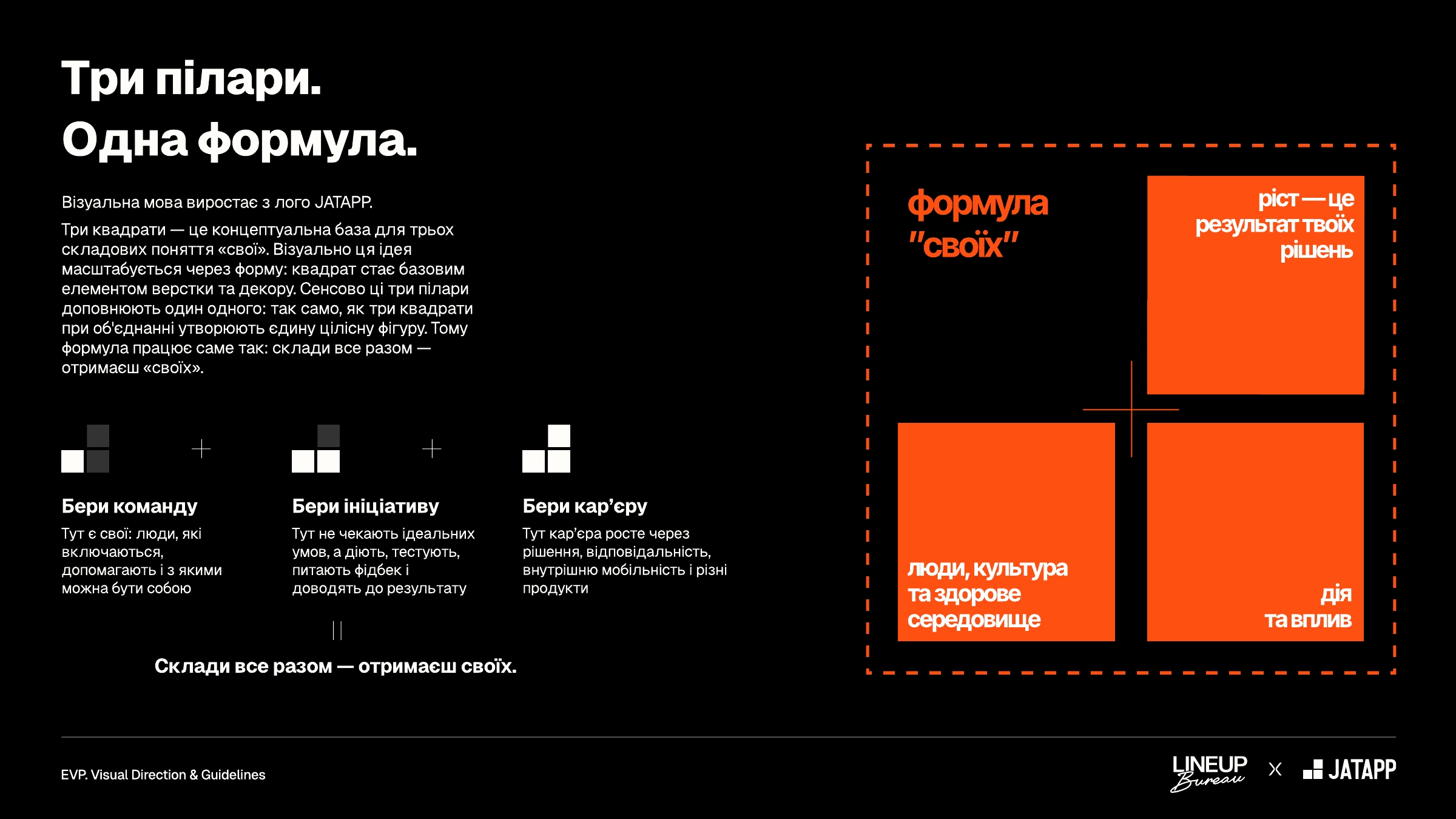
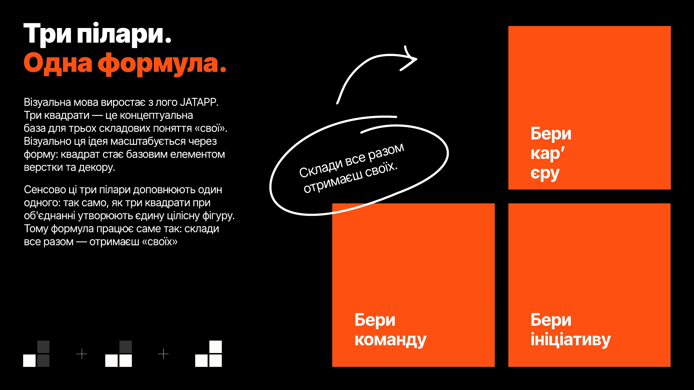
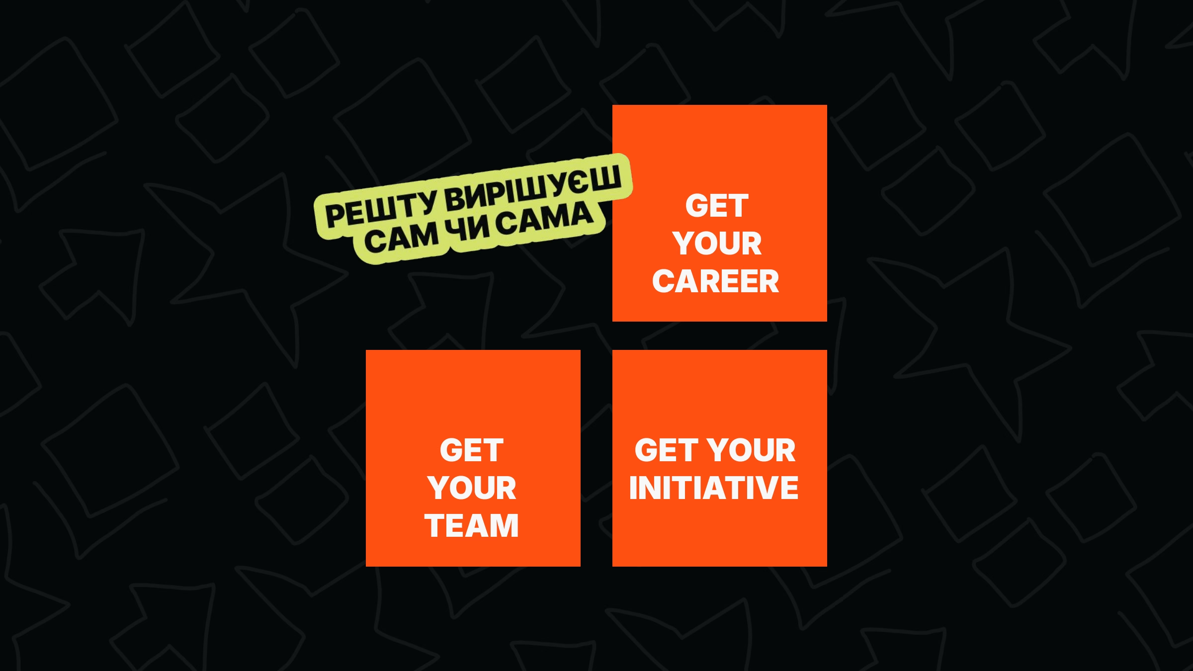
The visual language grows out of the JATAPP logo. We read the three squares of the mark as the three EVP pillars: get your team, get your initiative, get your career. Each one on its own is a part. Together they form a single shape, just as the three pillars come together into the idea of “one of us.”
The square became the base shape of the whole system: a mask for photos, a text plate, a pattern, and a background grid. It’s a flexible approach that lets the shape from the logo fit into any layout and amplifies what already exists in the brand.
Building the Employer Brand Visual Identity
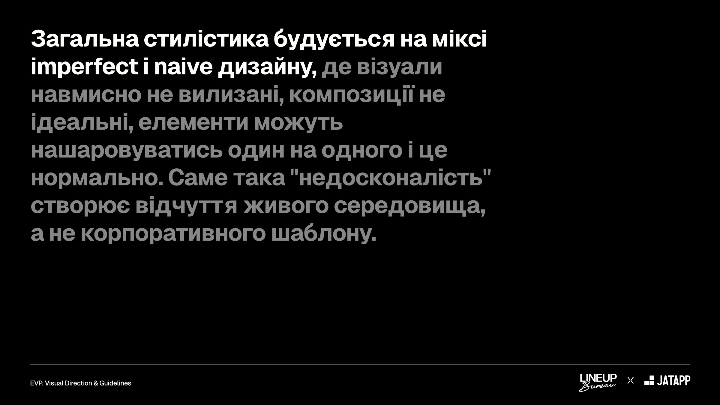
Visual Style: Imperfect + Naive
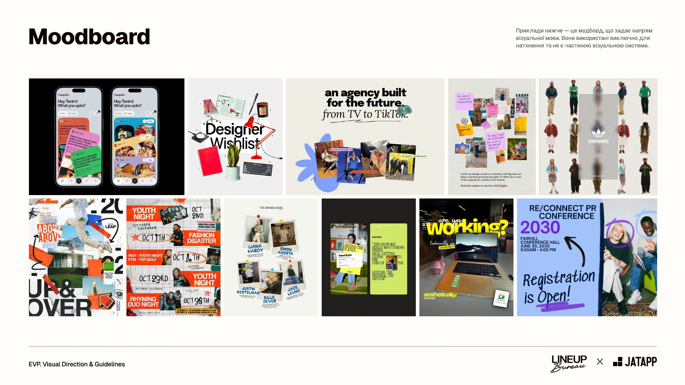
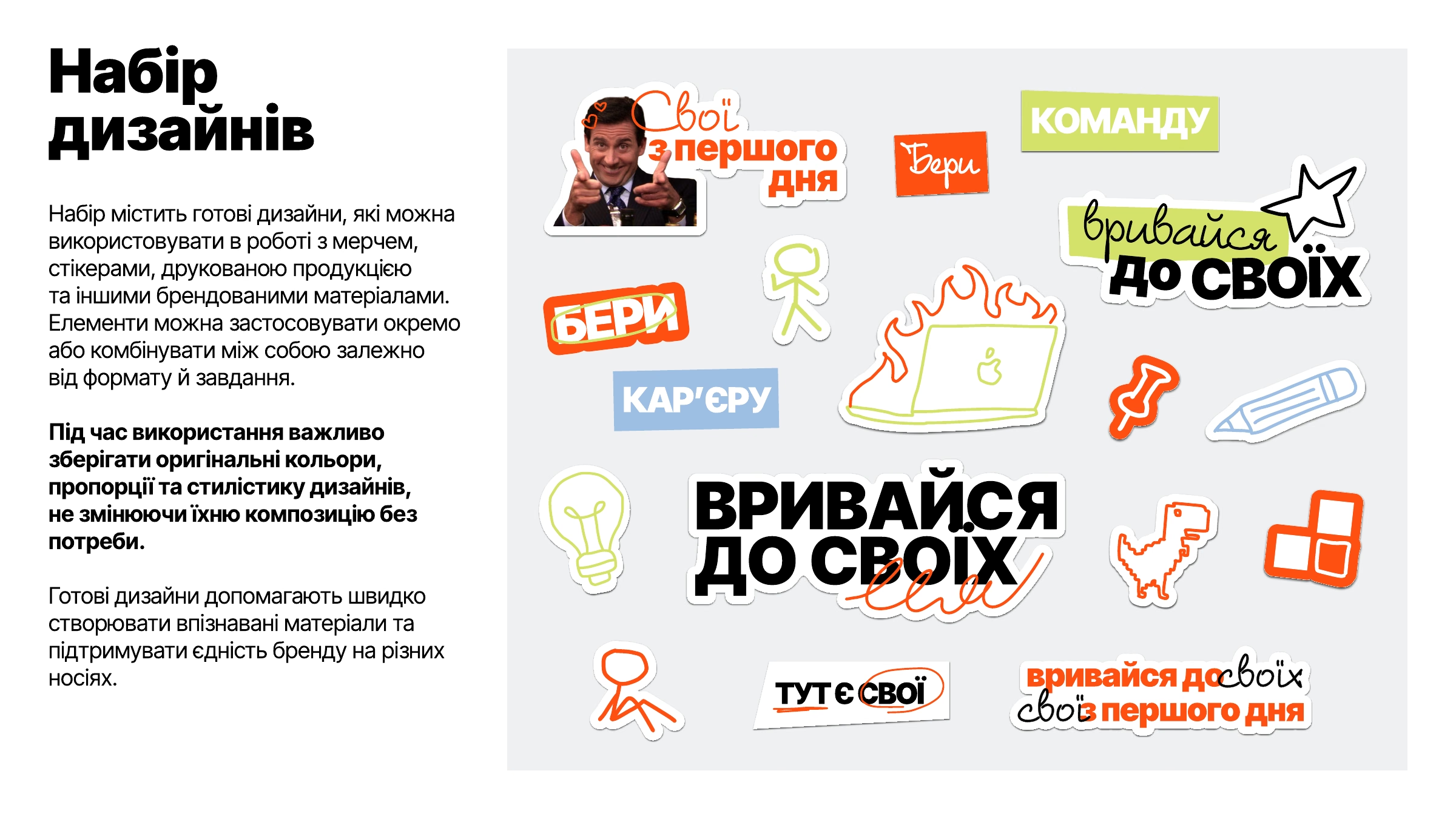
The overall style is built on a mix of imperfect and naive design. The visuals are deliberately unpolished: elements and graphics layer into dynamic collages, local memes and screenshots from work chats sit next to imperfectly cut-out photos, and handwritten words put the focus on what matters most.
This controlled carelessness is a deliberate design decision. It amplifies the “one of us” message and becomes a marker of sincerity that sets JATAPP’s communication apart from standard corporate formats.
Color System: Colors Only Your People Get
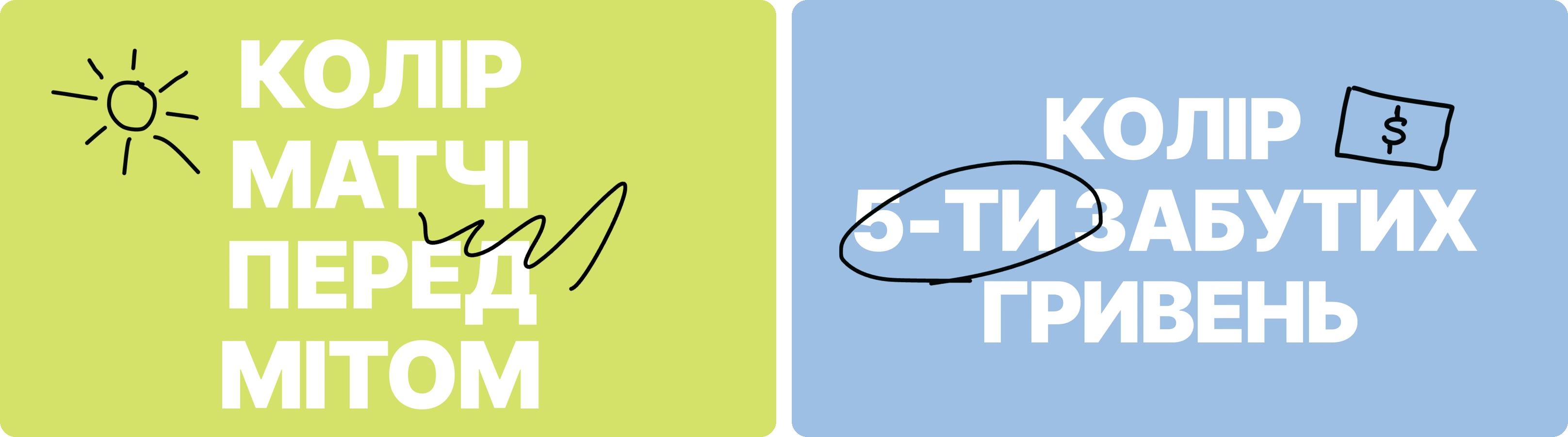
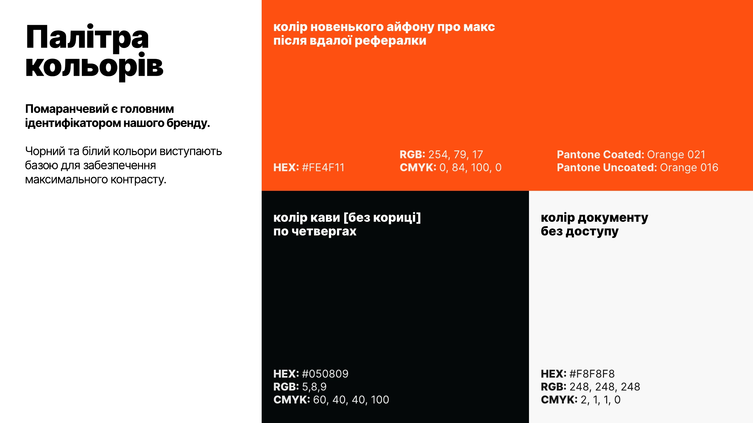
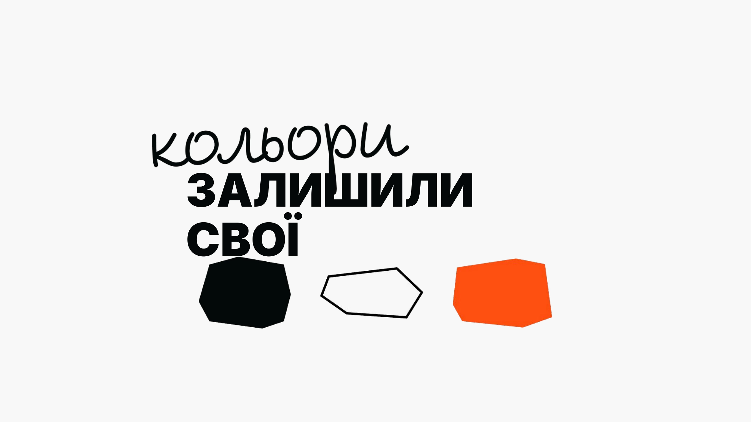
JATAPP’s core palette stayed the same: orange, black, and white. What changed is how it’s used: flat only, no gradients or textures, so color works as a bright accent rather than decoration. And each color got a name that only insiders understand.
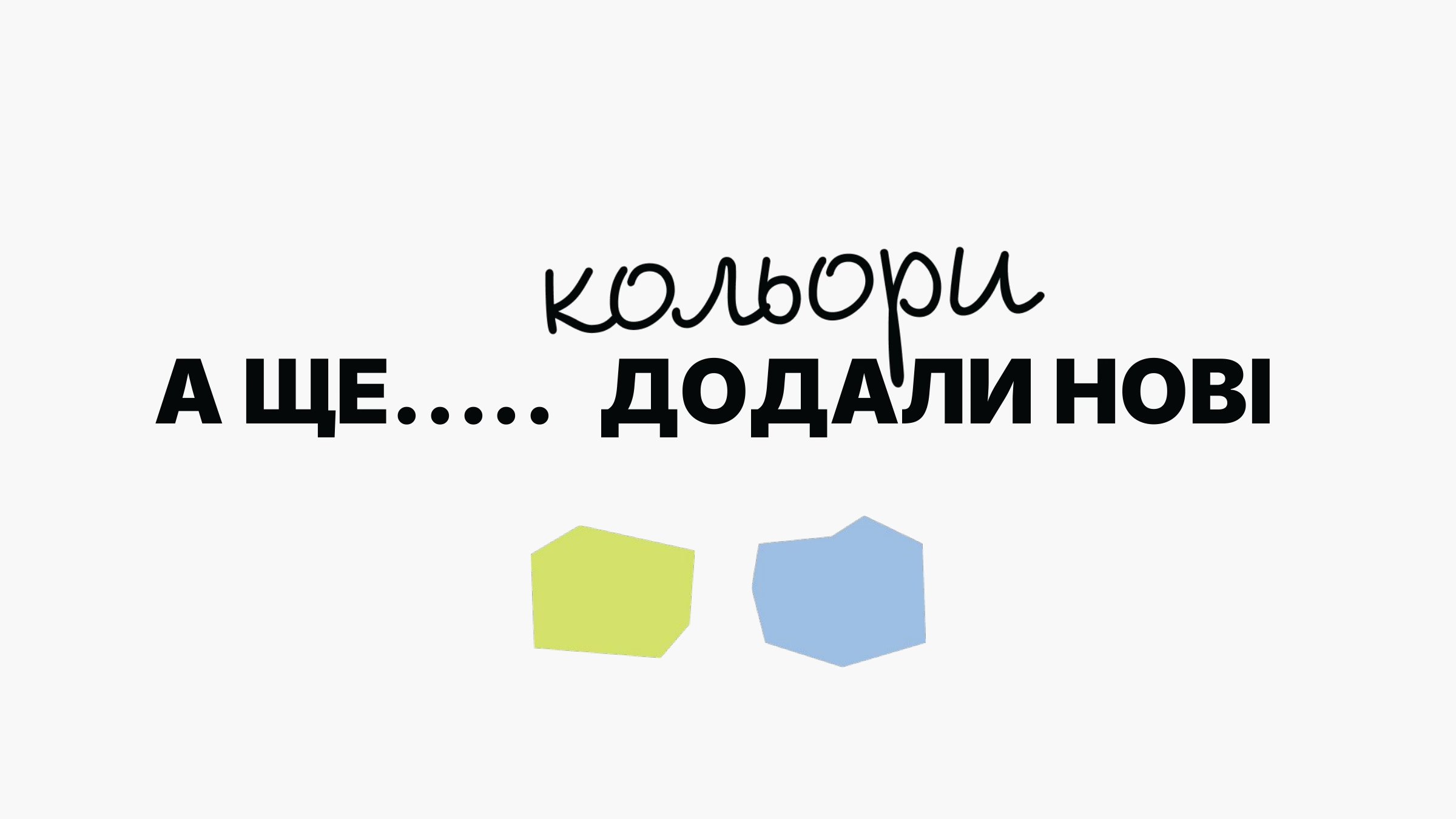
The JATAPP team went further and added two more colors to the palette, named in the same spirit.

Typography for a More Human Employer Brand
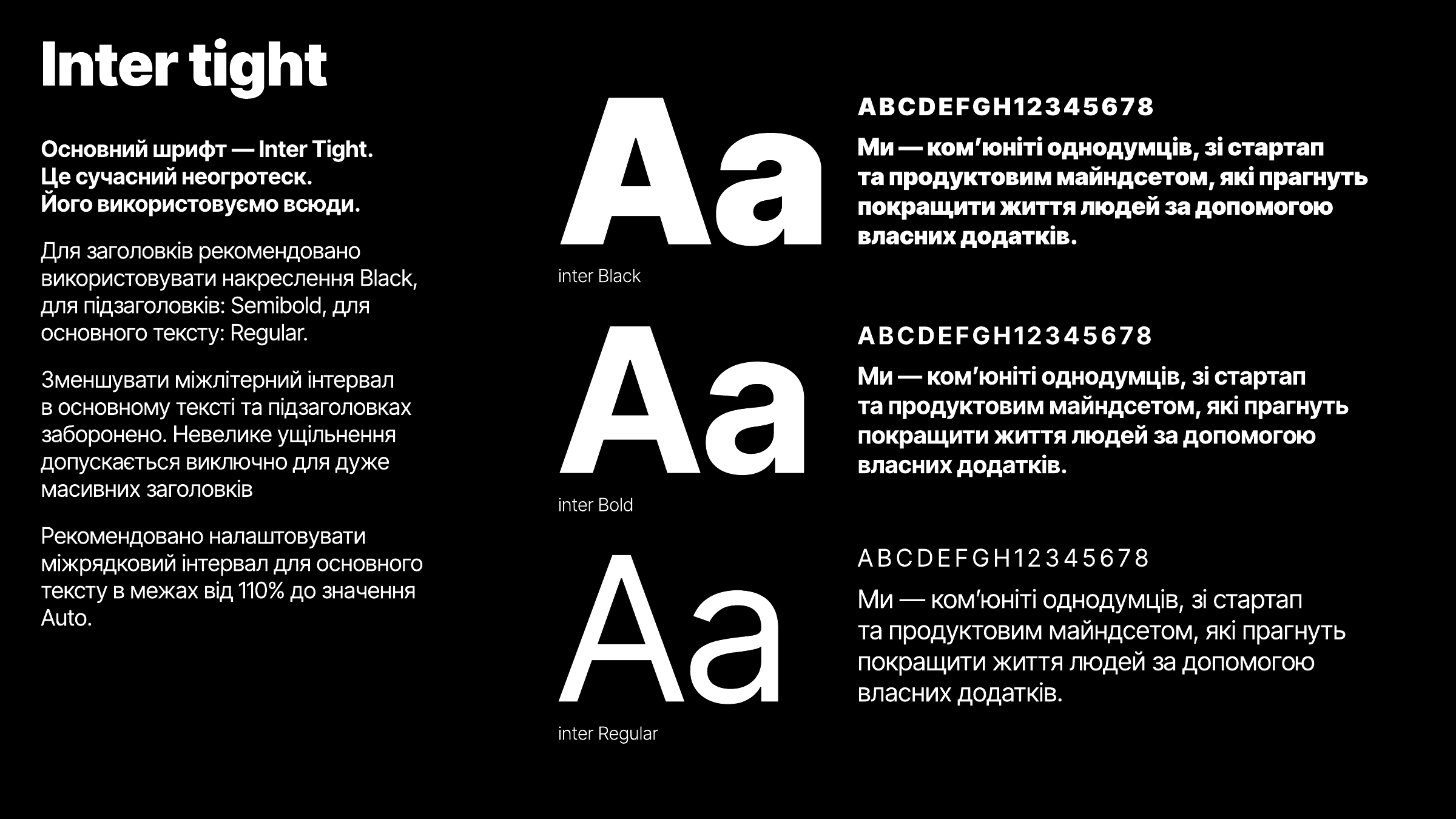
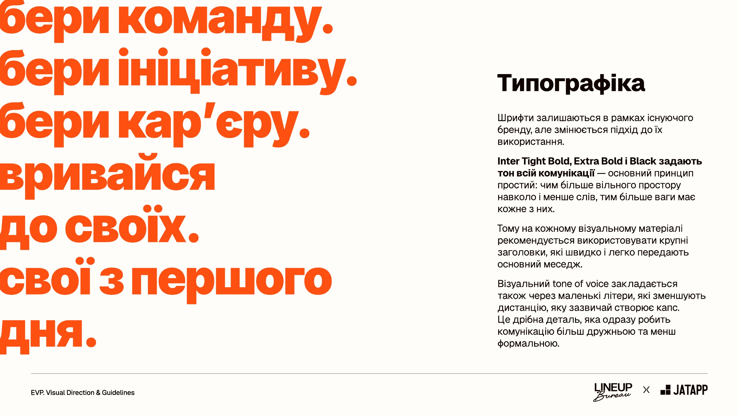
When you’re building a consistent employer brand, fonts matter too. The brand’s main typeface remained Inter Tight, which JATAPP had already been using in its communication. We proposed rules for using it: heavy weights, large headlines, minimal words, and plenty of white space.
We also suggested writing in lowercase more often instead of all caps. All caps sounds like an official announcement, while lowercase sounds like a message from a colleague, so the distance between the brand and the people it speaks to gets smaller. In the final guidelines, all caps stayed for large accent headlines and covers.
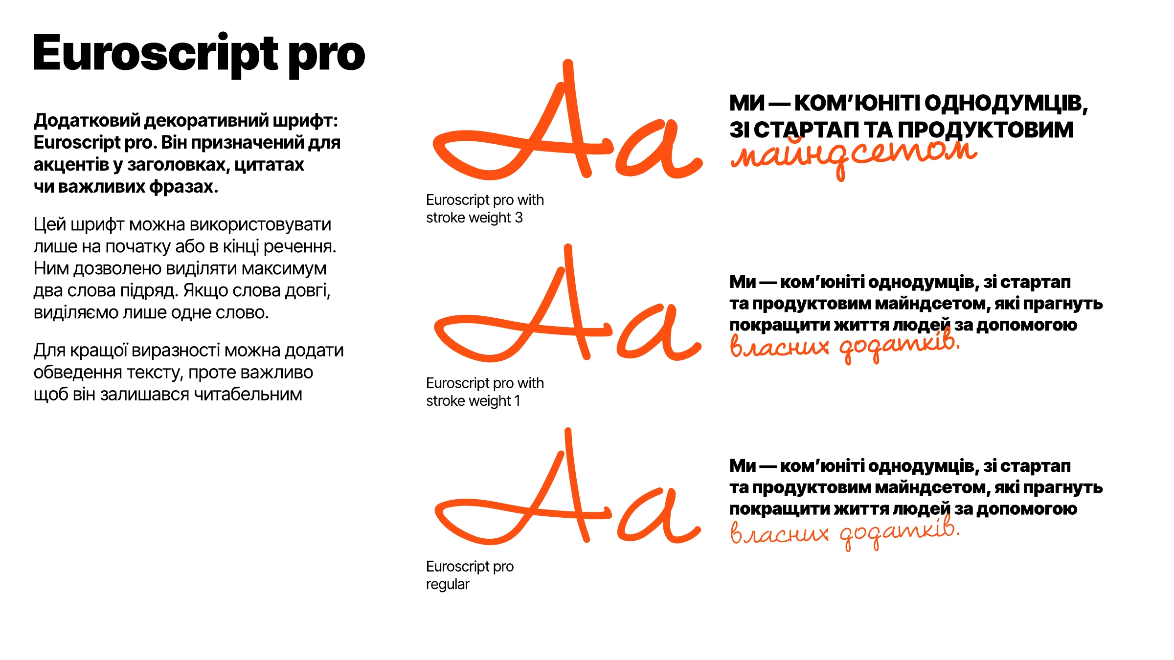
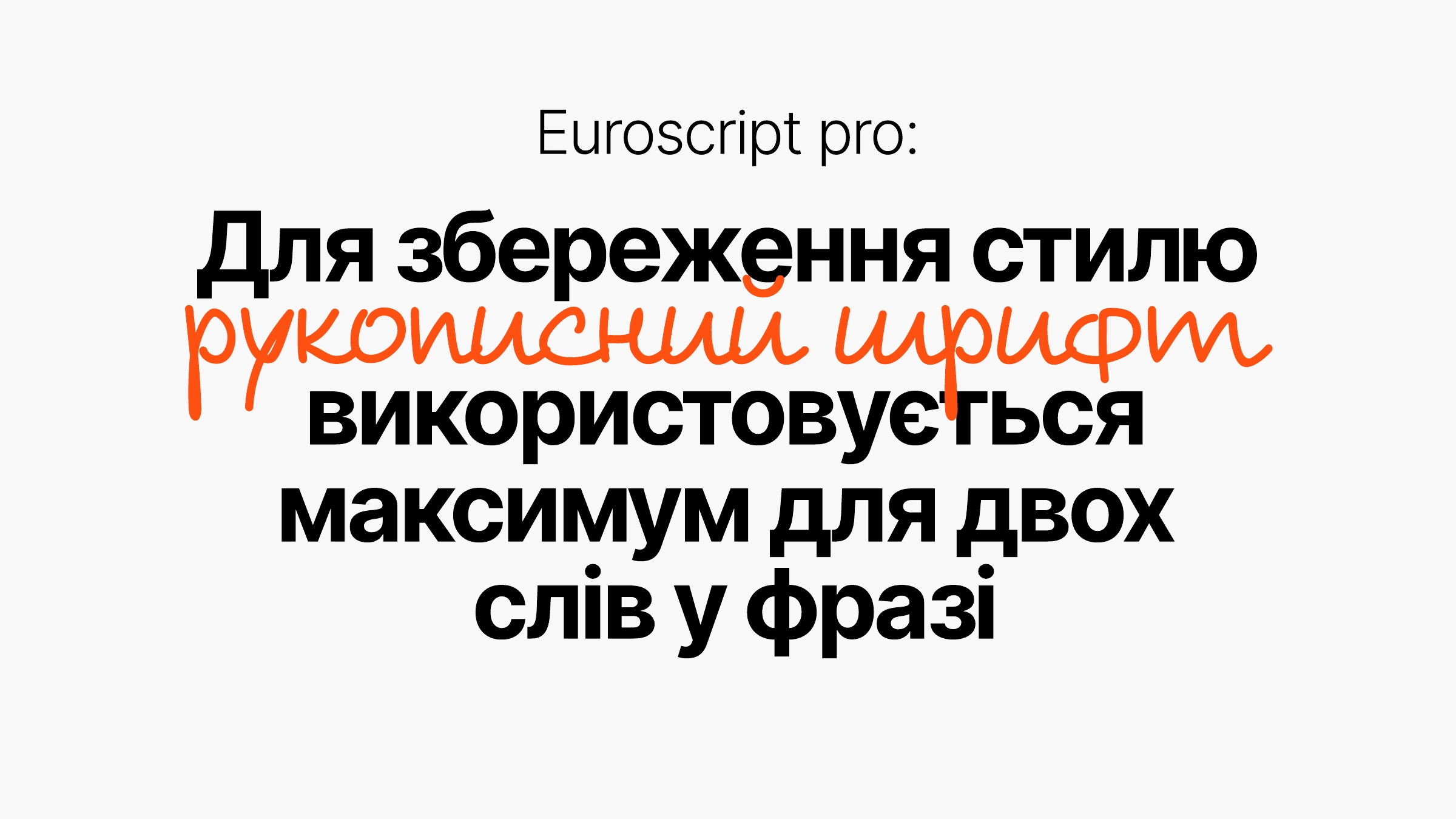
A handwritten typeface became the accent of the system. One or two words in a layout add authenticity to the brand and remind people that there are real people behind it.
A Hand-Drawn Mark
The JATAPP mark is both the foundation and the continuation of the updated visual language — its core element. It got its own expression too: we proposed drawing it by hand.
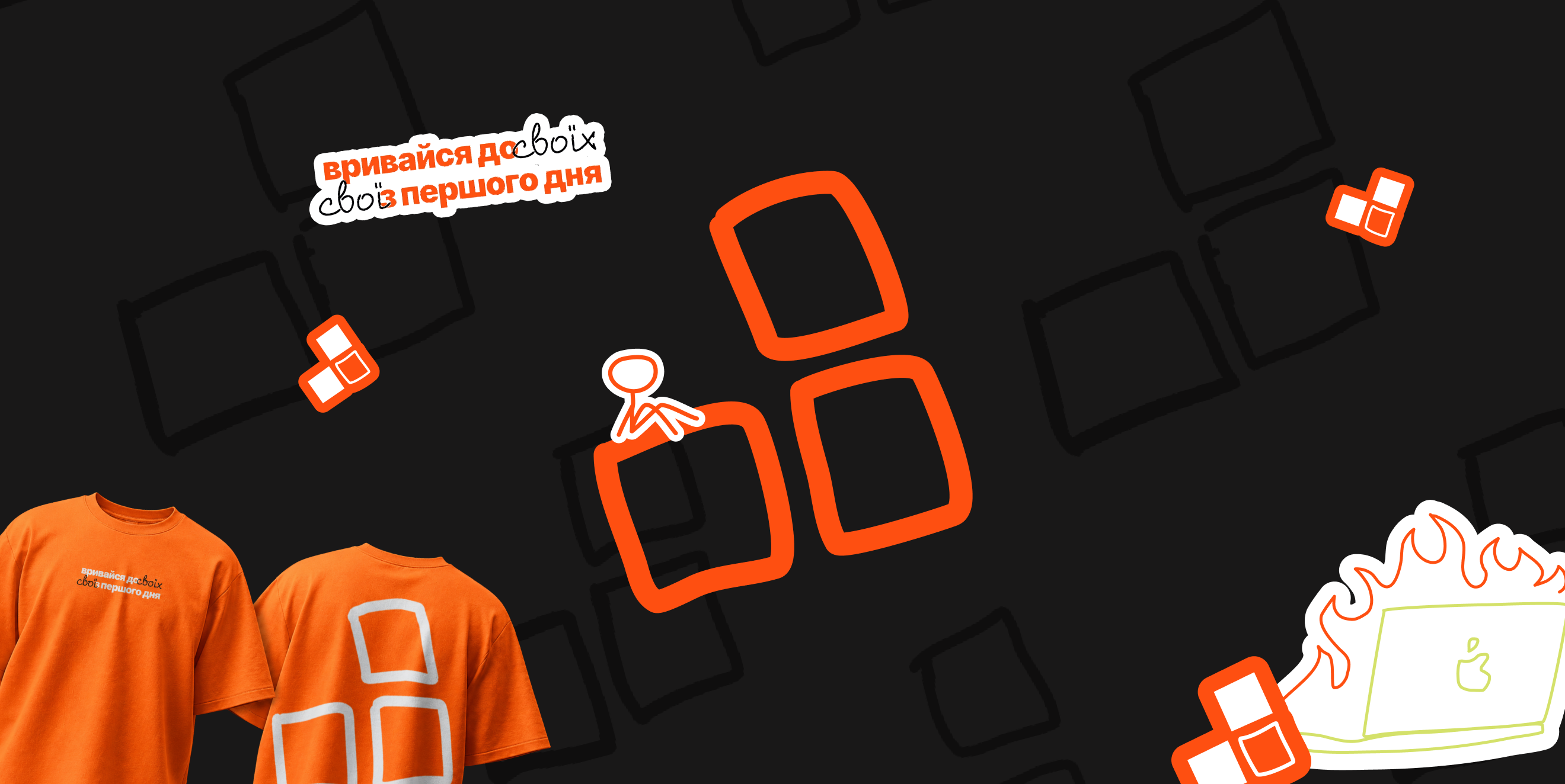
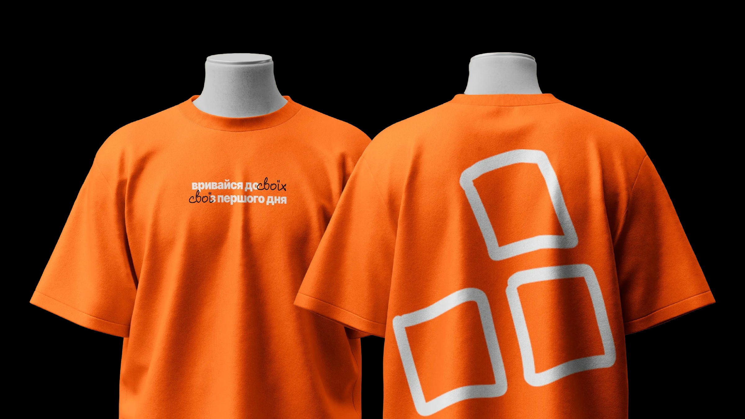
The hand-drawn mark makes communication as human as possible and continues the logic of the system. This version of the logo became the basis of the graphics: patterns are built from it, and it appears on covers, T-shirts, and packaging.
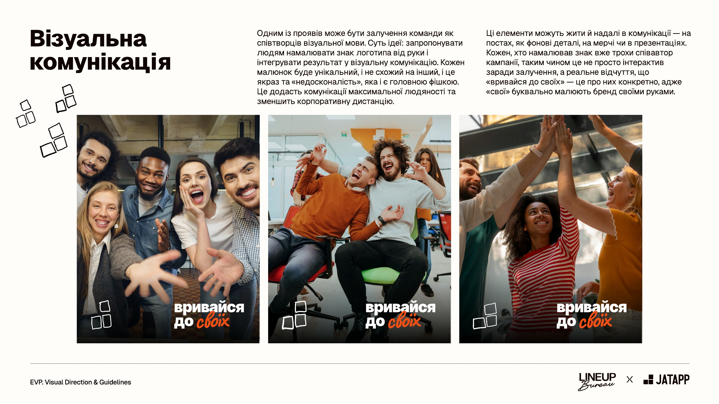
This approach can also involve people themselves. Everyone on the team can draw the mark in their own way, and a simple shape turns into a unique element unlike any other. It can be integrated into visual communication, and the person who drew it becomes a bit of a co-author of the campaign. It’s not interactivity for the sake of engagement but a real sense that “one of us from day one” is about them specifically: your people literally draw the brand with their own hands.
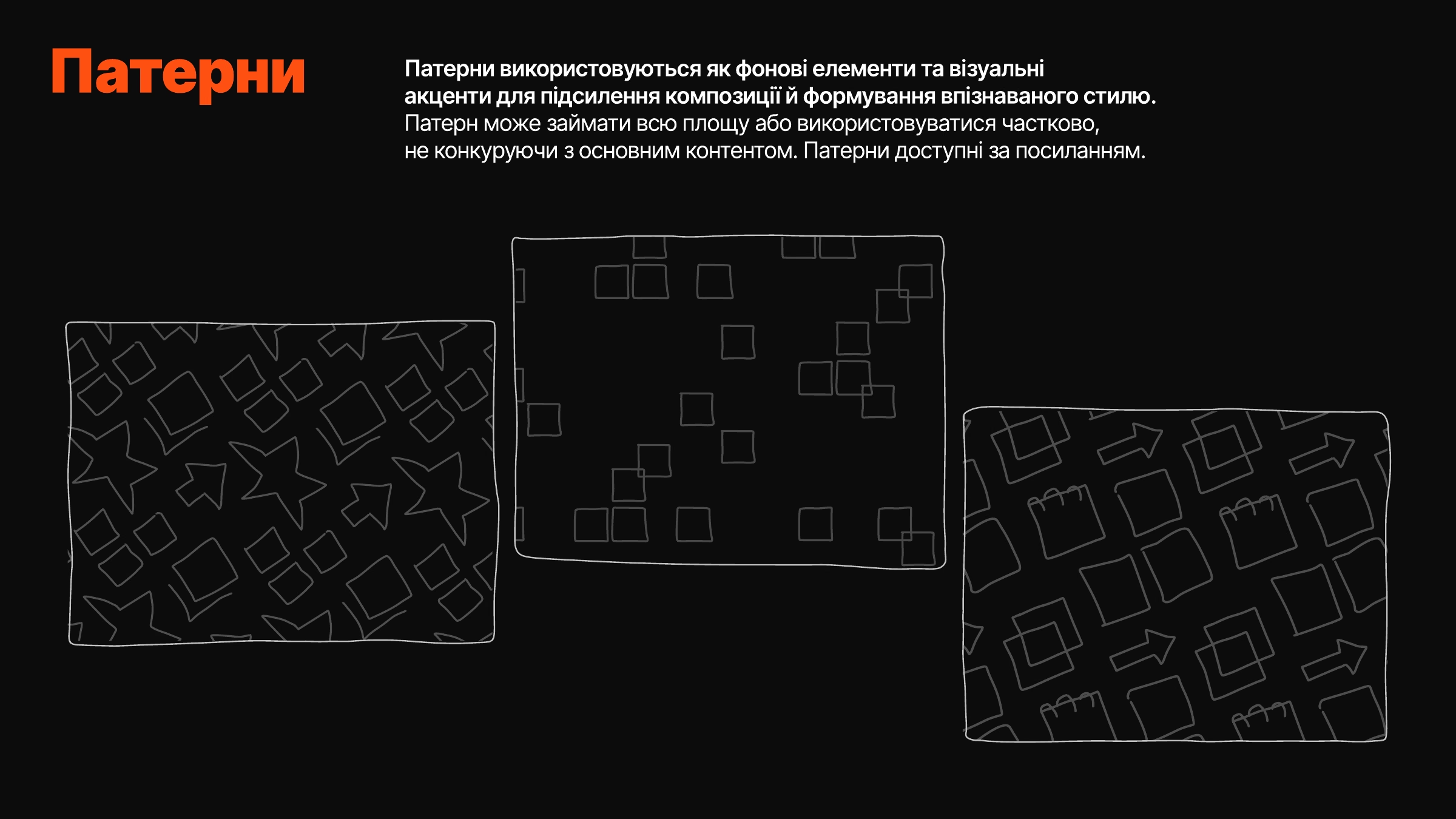
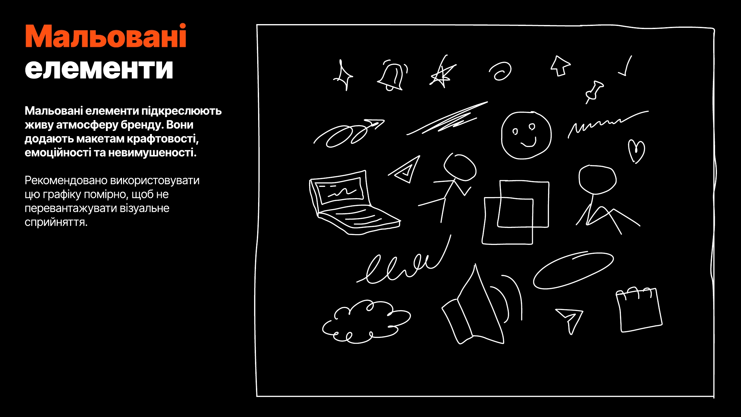
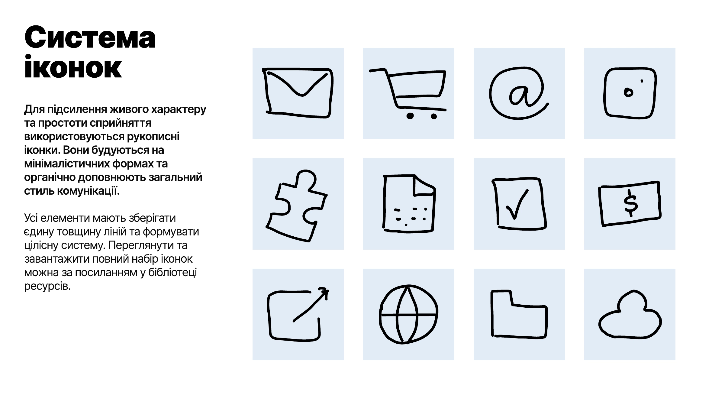
The JATAPP team expanded this idea and developed a whole system around the mark: doodle icons, hand-drawn arrows and stars, square patterns, and stickers with inside jokes. In layouts, they come together into a collage and make the communication recognizable even without the logo.
The Visual System in Practice
The system works across all touchpoints — from job posts and reels covers to internal presentations and infographics. First, we showed what it could look like in concept layouts, then the JATAPP team developed them into full templates.
Social Media and Presentation Templates
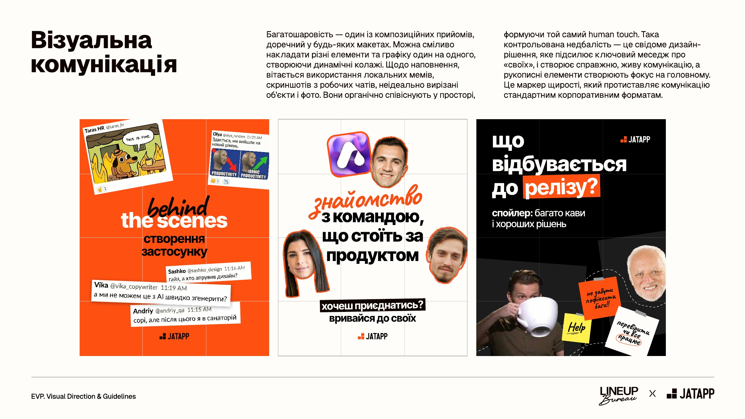
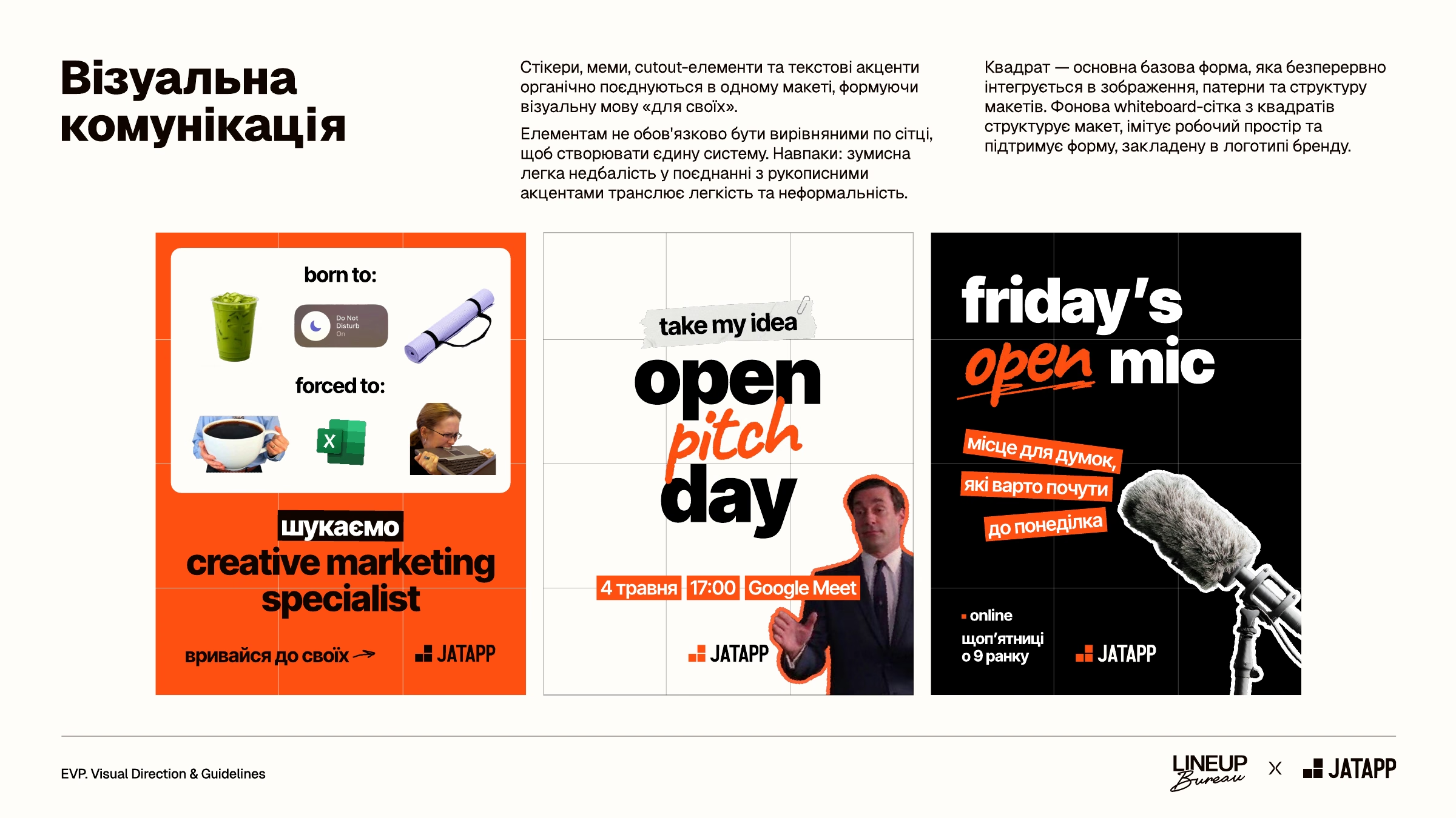
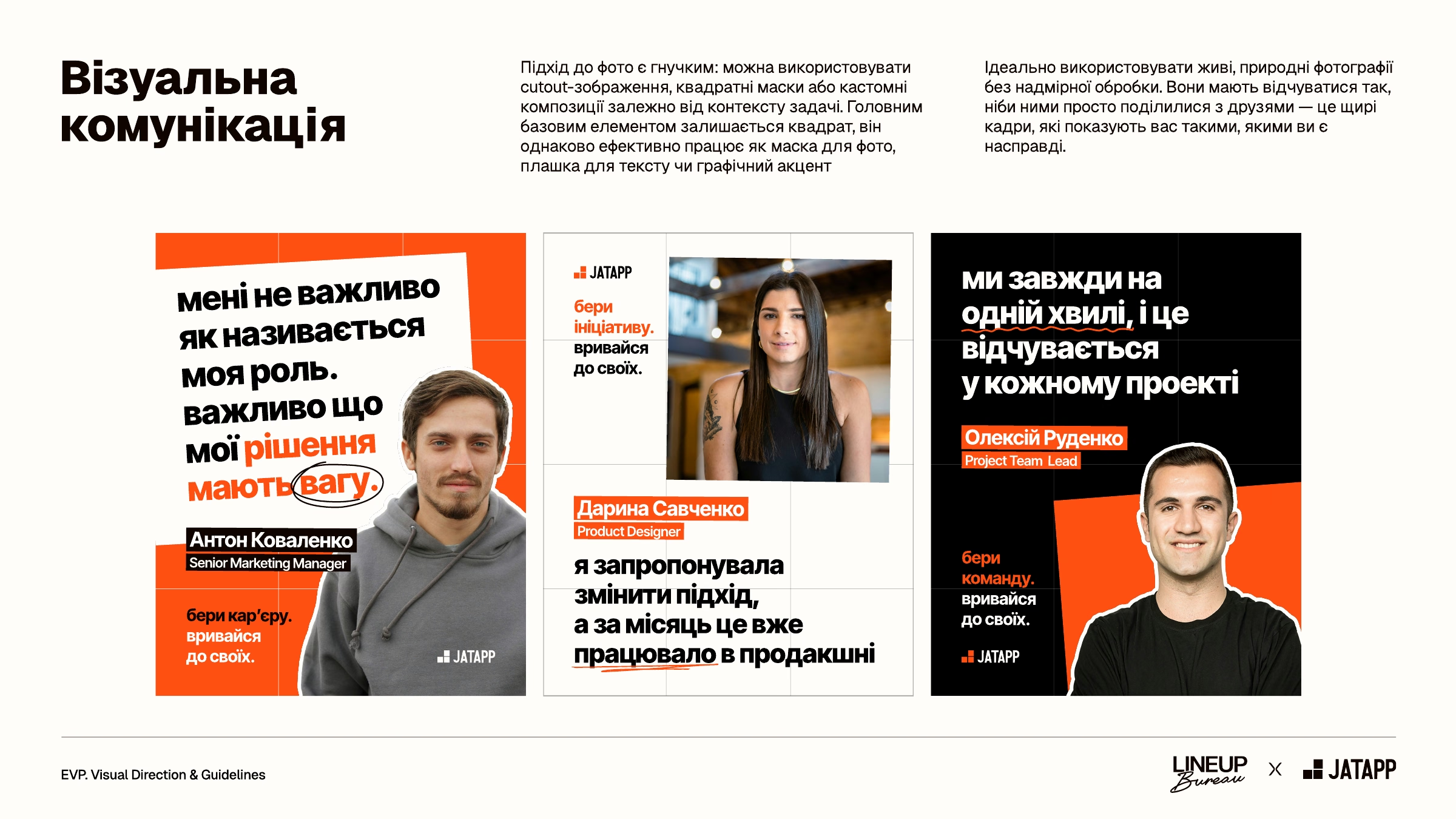
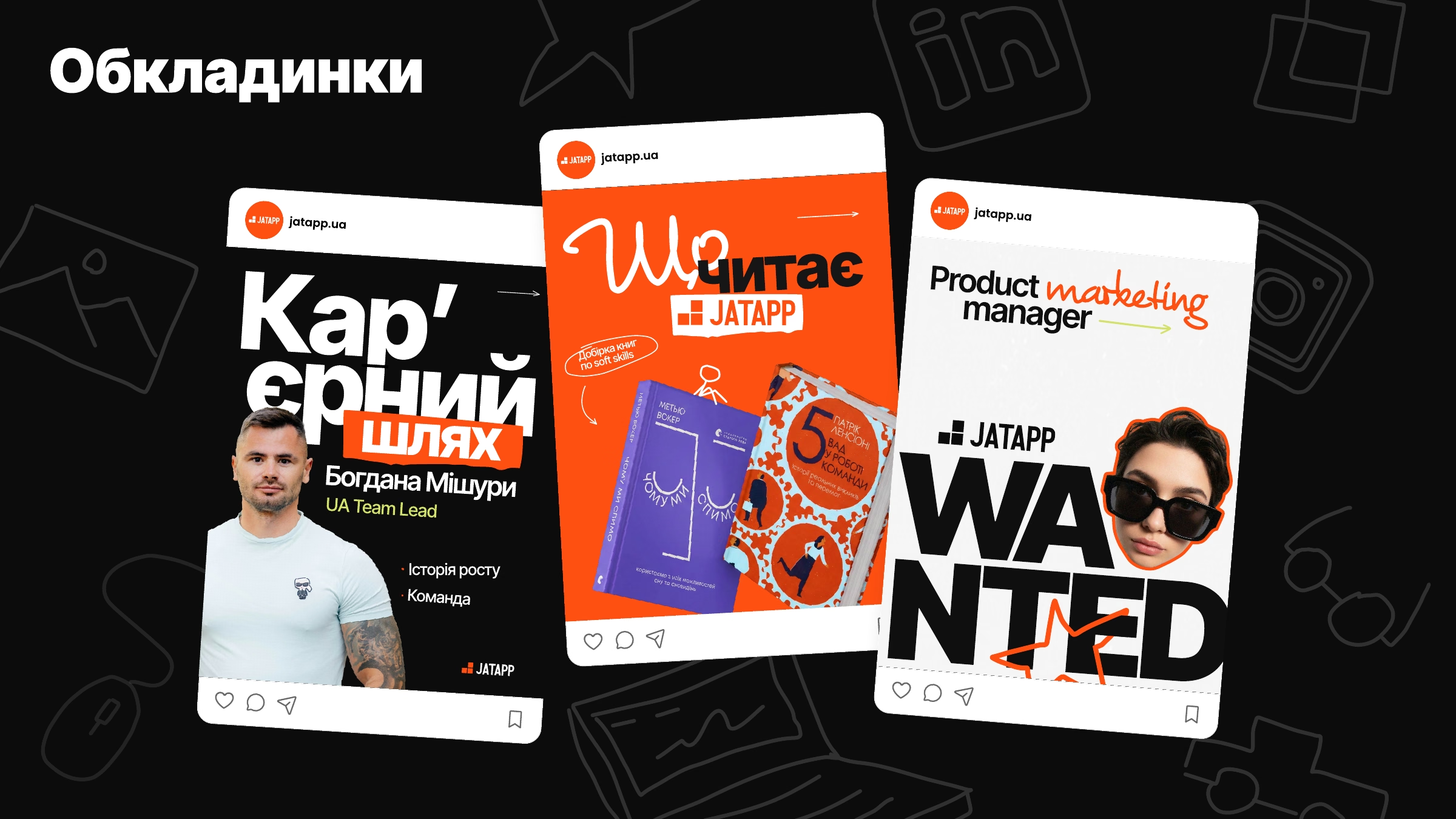
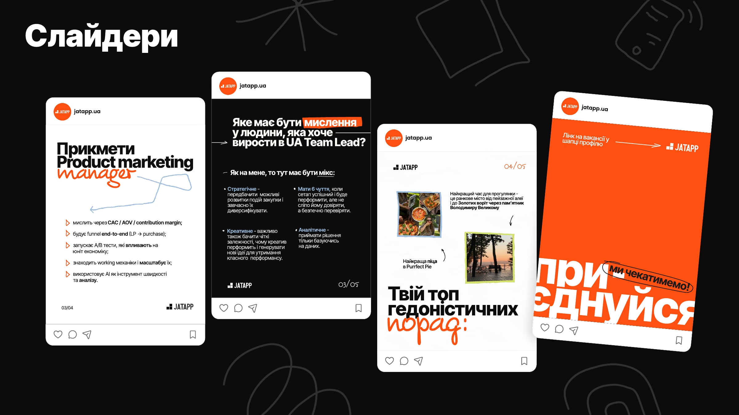
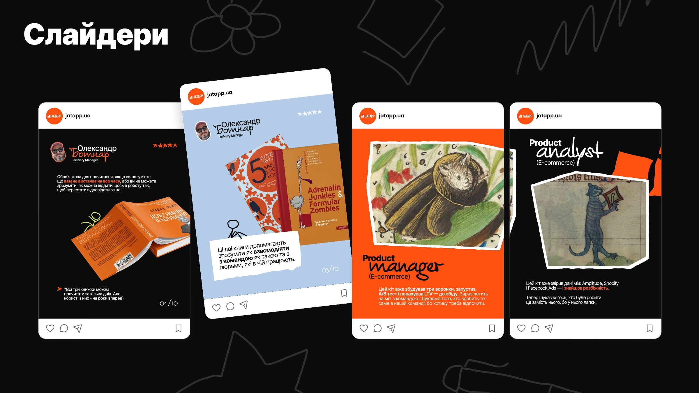
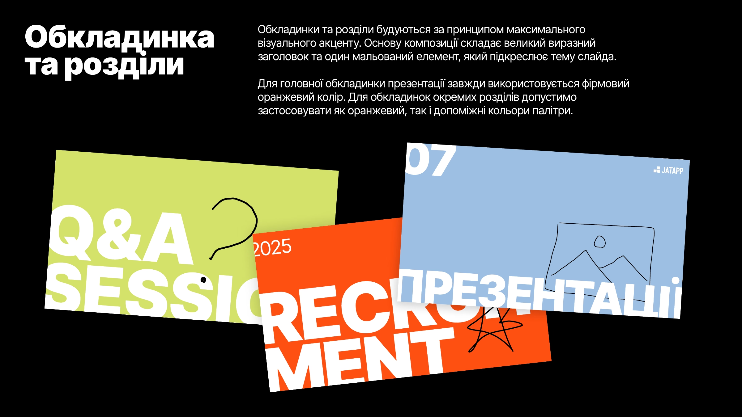
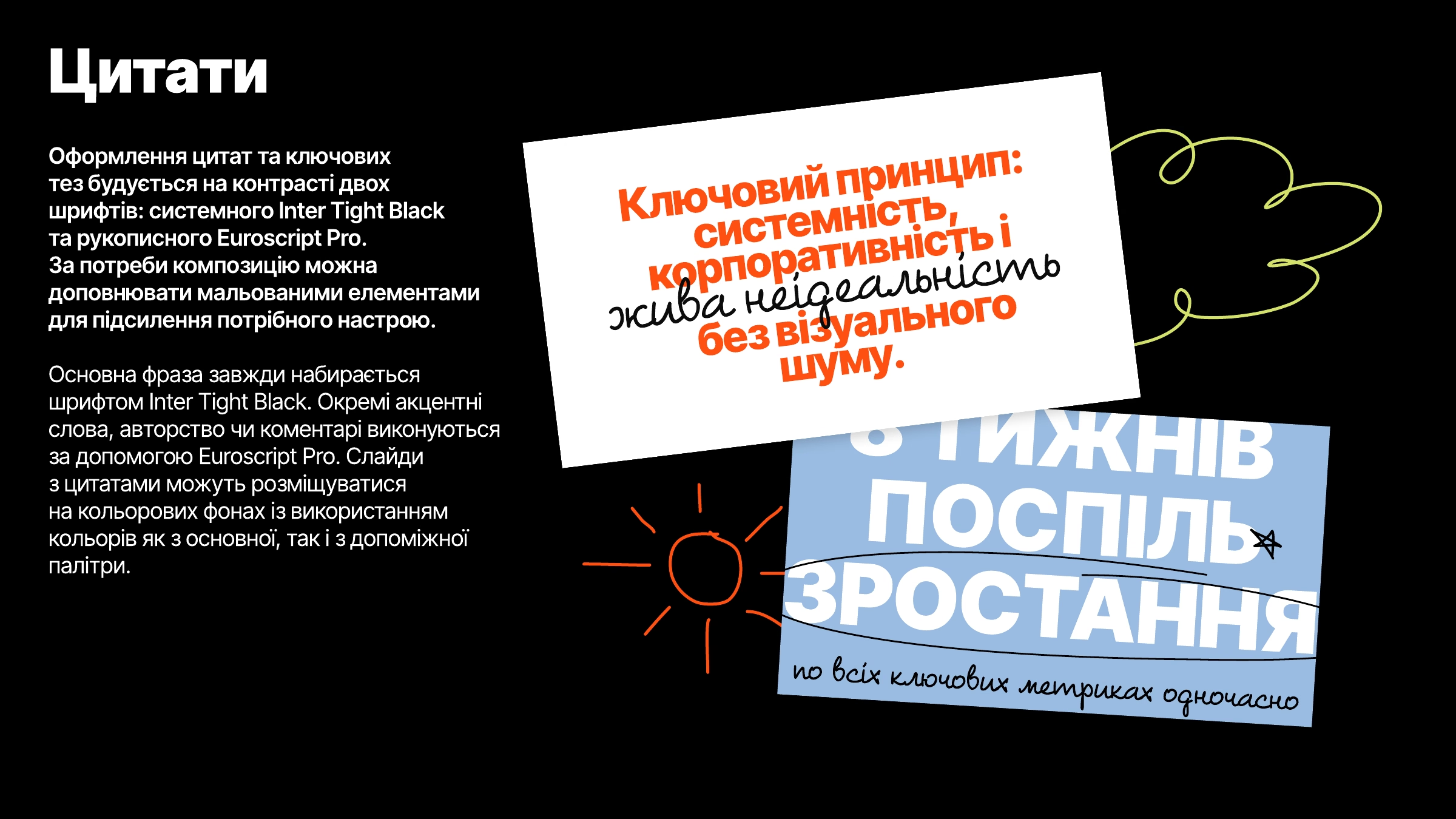
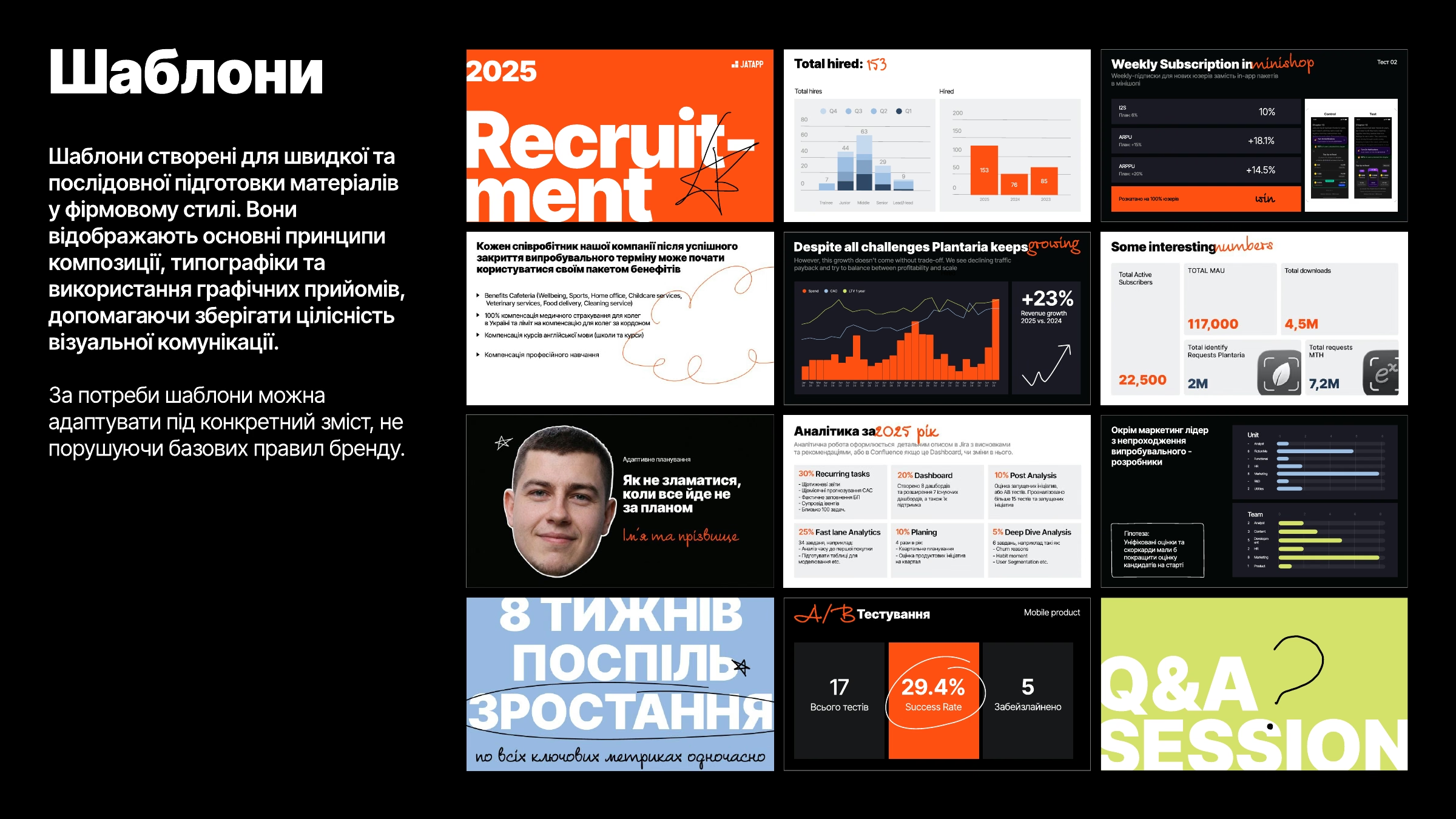
Photo and Web Direction
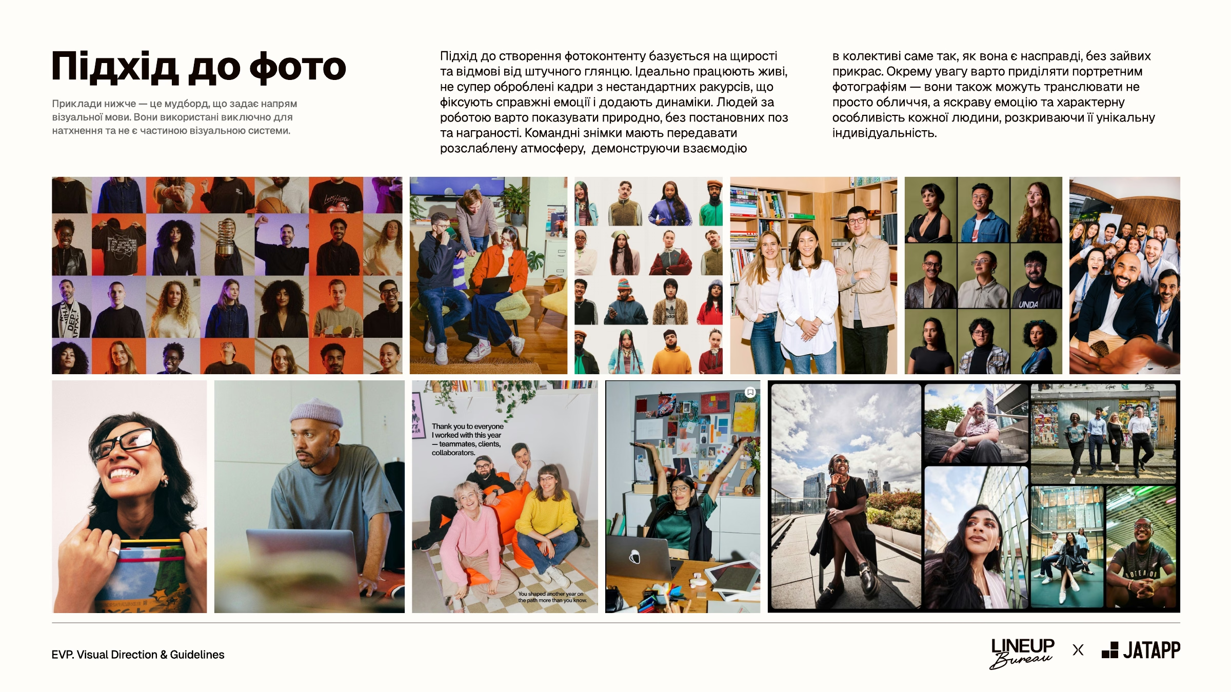
We built the approach to photo content on sincerity and a rejection of artificial gloss: lively, lightly edited shots from unusual angles, people at work without staged poses, team photos with a relaxed atmosphere. Portraits should show not just a face but each person’s emotion and character.
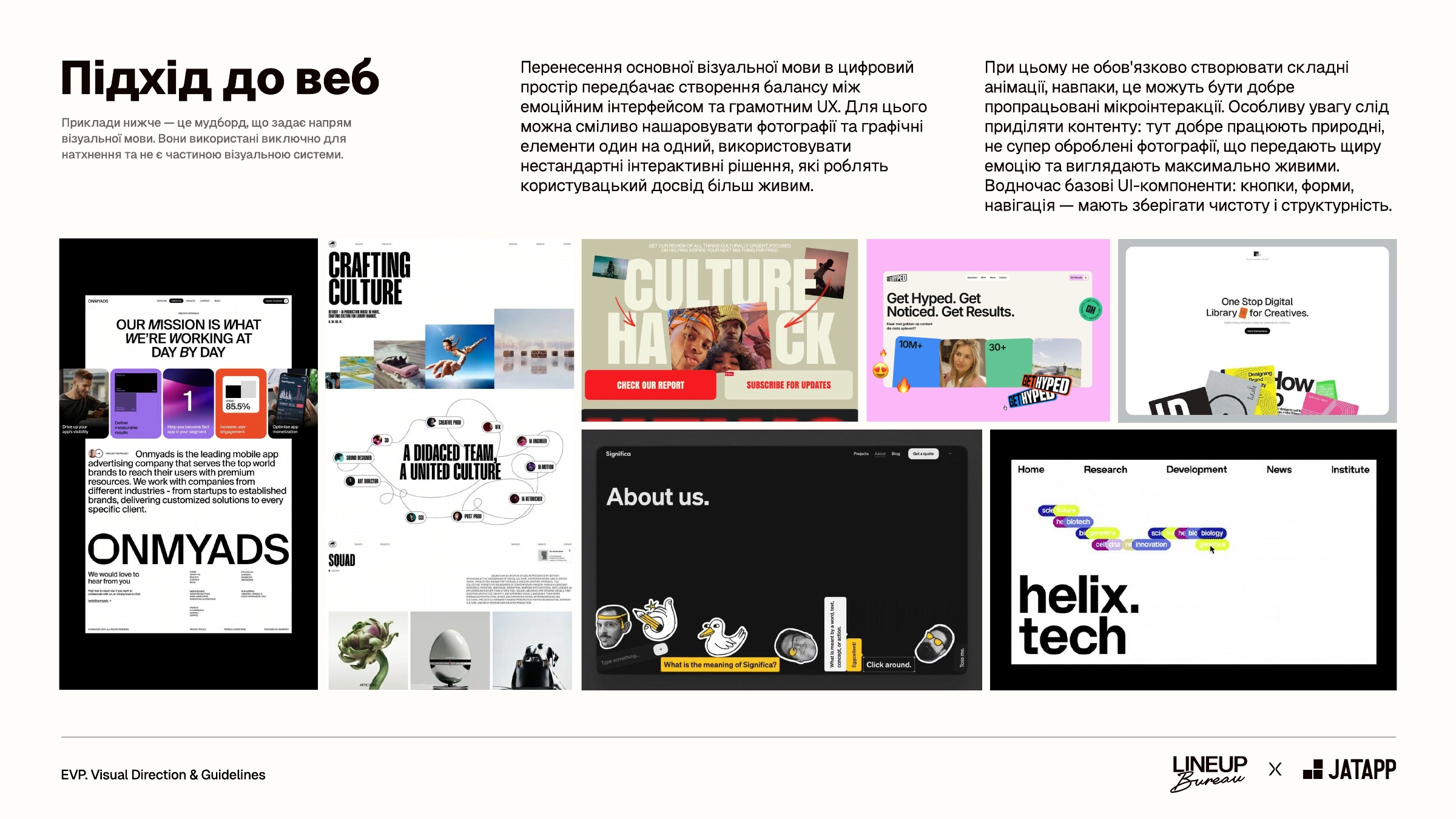
For the web, we described how to carry the visual language into digital space and keep a balance between an emotional interface and convenient UX. Photos and graphics can overlap, and liveliness comes from well-crafted micro-interactions rather than complex animations. Basic UI components — buttons, forms, navigation — stay clean and structured. We set this approach as a direction for the future, for the website and other digital products.
Employer Brand Merch
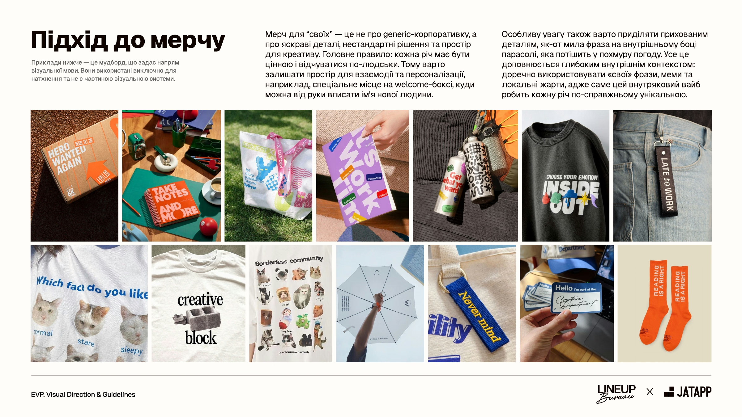
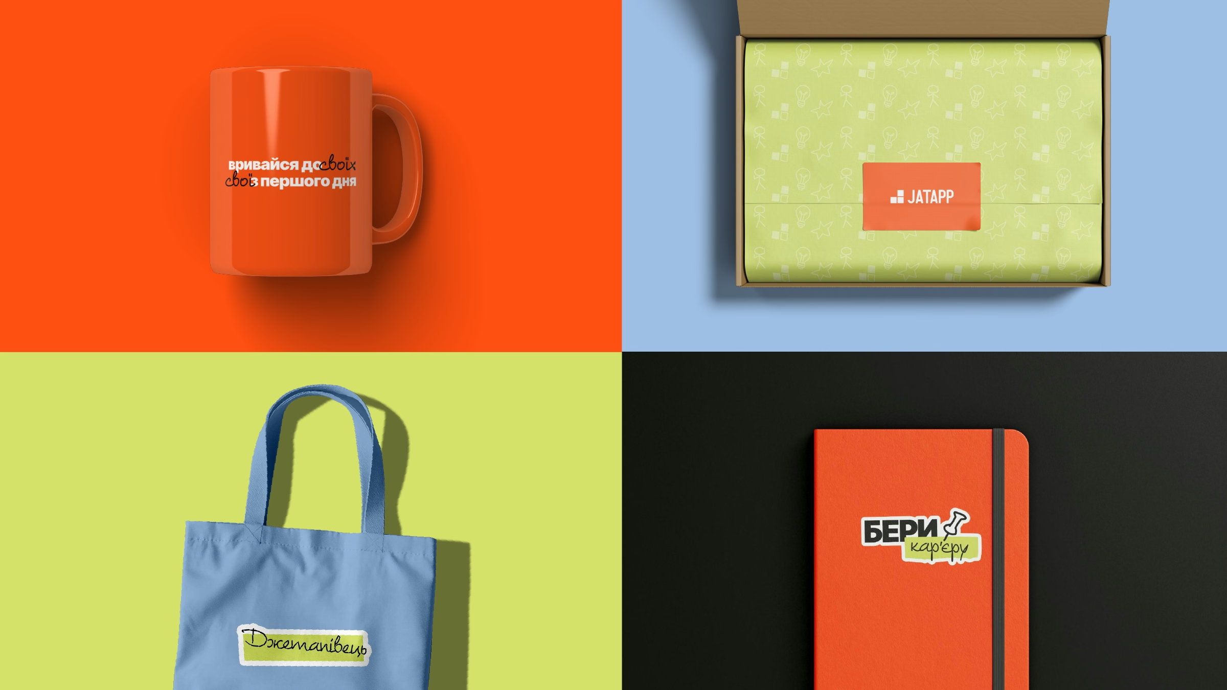
We suggested looking at merch for your people not as generic corporate swag but as a space for bright details and unconventional solutions. The main rule: every item should be valuable and feel human. That’s why it’s worth leaving room for interaction and personalization, for example, a new hire’s name handwritten on the welcome box.
Special attention goes to hidden details, like a sweet phrase on the inside of an umbrella that cheers you up in gloomy weather. And to internal context: “one of us” phrases, memes, and local jokes make each item truly unique.
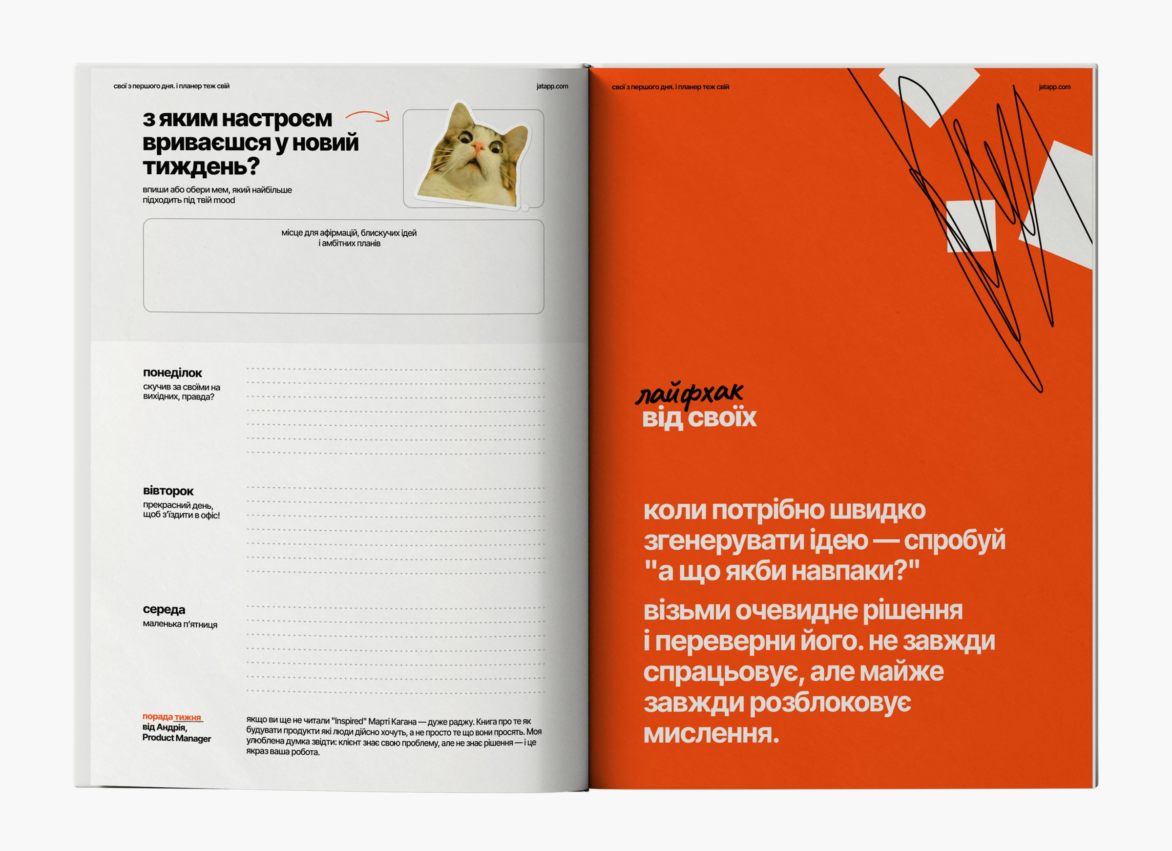
As an example of this attention to detail, we proposed the concept of “your own planner.” It turns an ordinary corporate item into a personalized experience and a living element of interaction. The concept includes:
- a sticker pack with memes and stickers to interact with the planner;
- a mood tracker: at the start of each week, a “What mood are you jumping into the week with?” block, where you can write down your thoughts or stick a meme from the set;
- blocks with local jokes, life hacks, and tips from colleagues — from useful work tools to places to unwind after a busy week;
- a custom anti-stress coloring page.
Even the days of the week speak the language of your people: Monday — “missed your people over the weekend, didn’t you?”, Tuesday — “a great day to head to the office!”, Wednesday — “little Friday.”
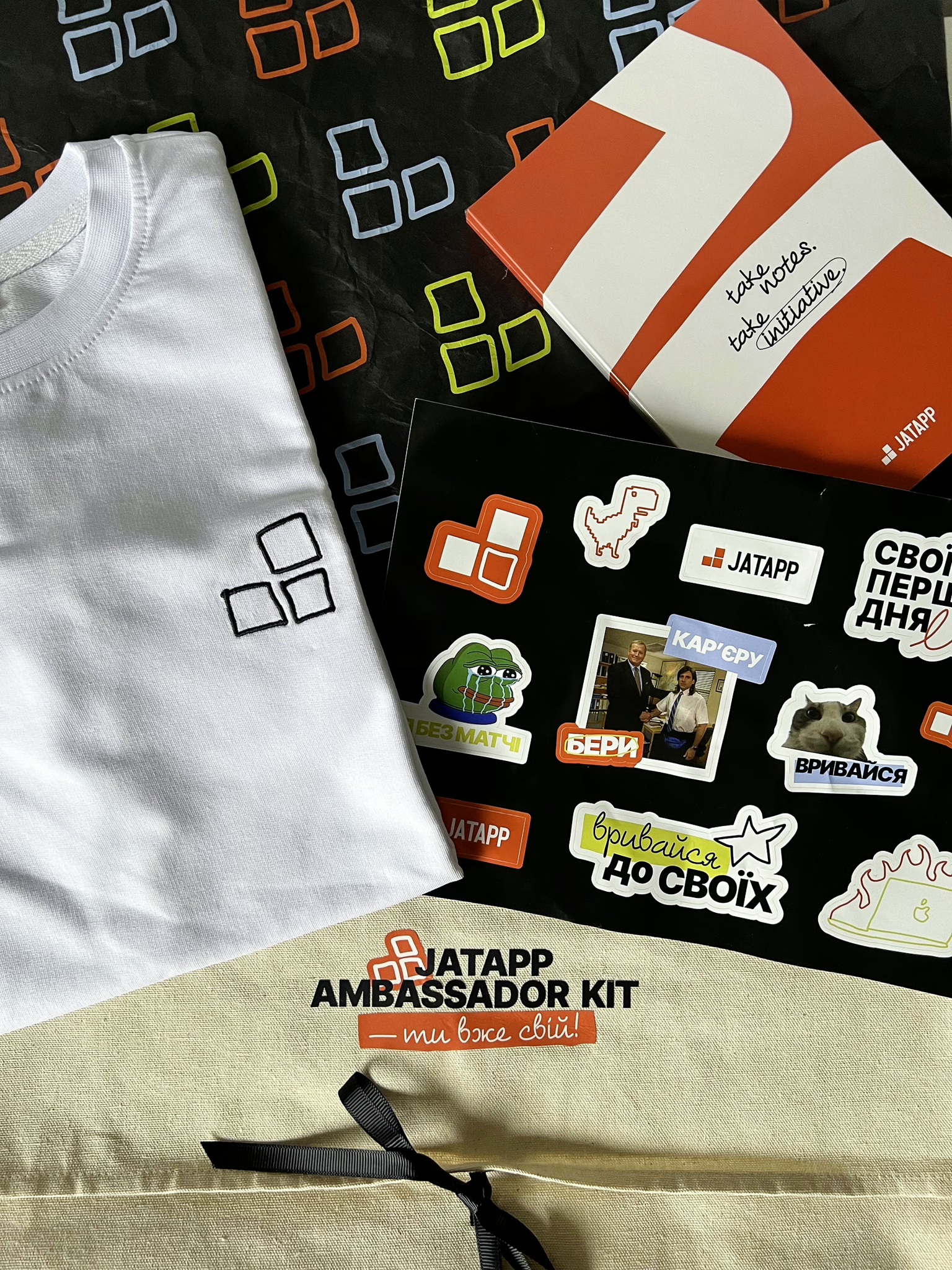
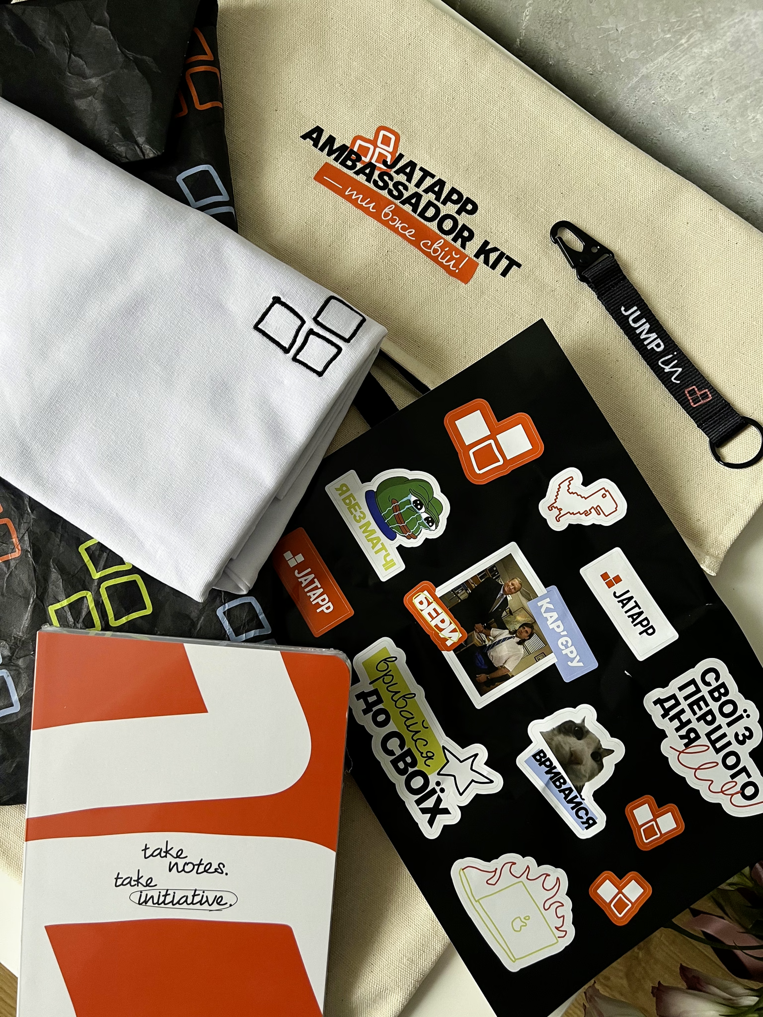
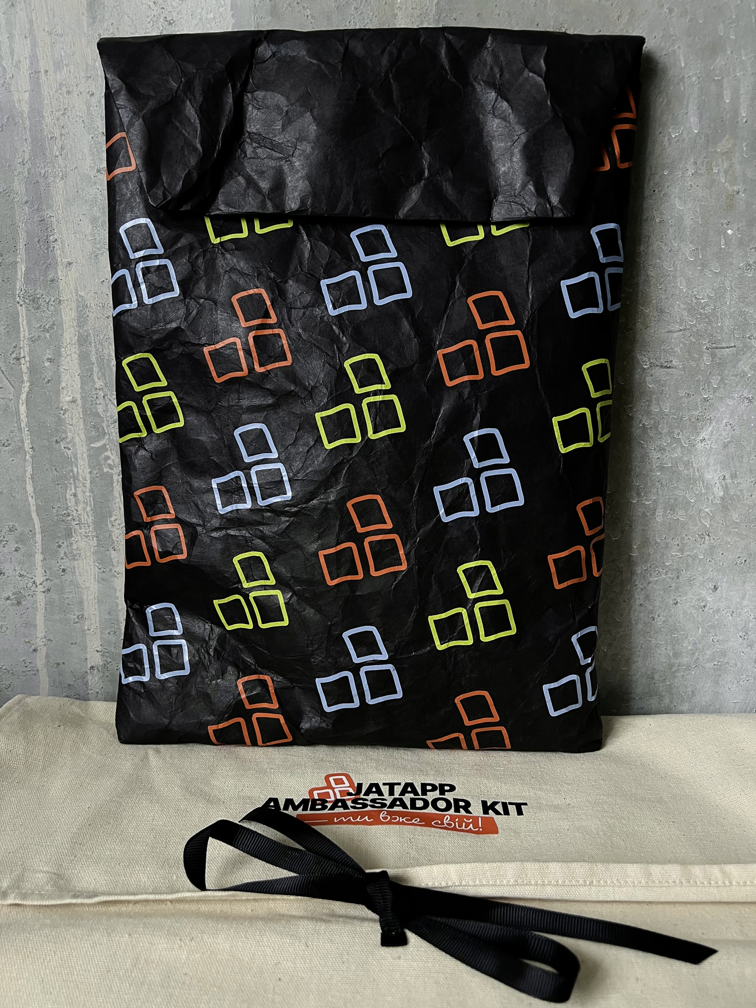
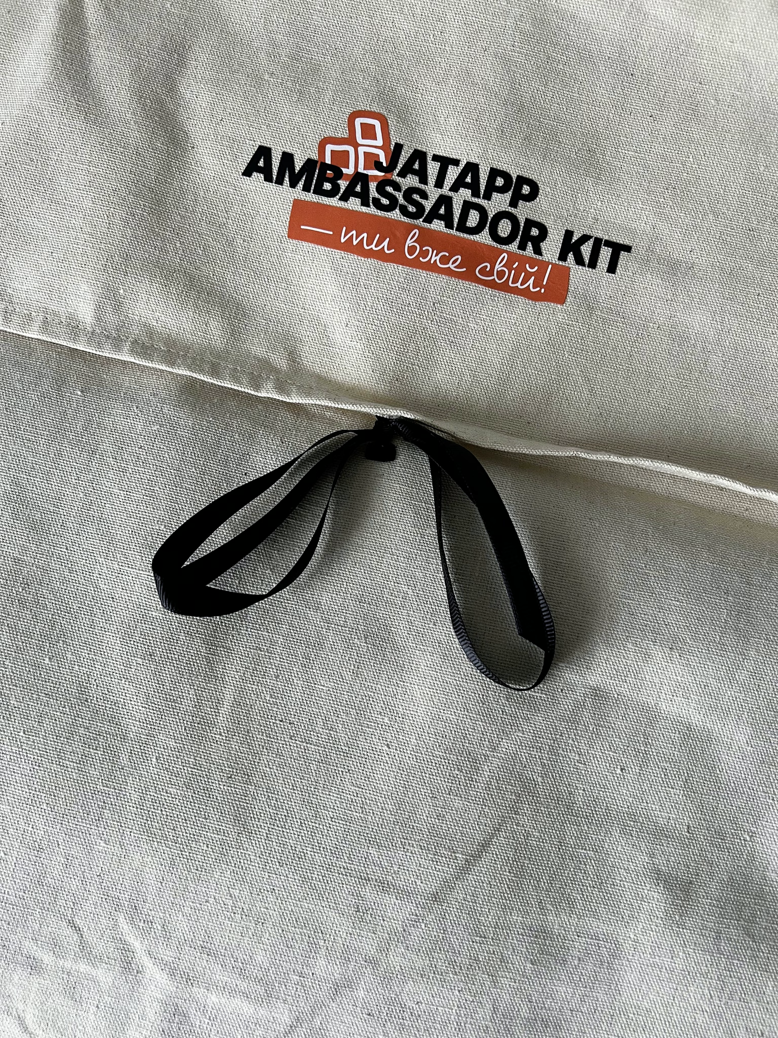
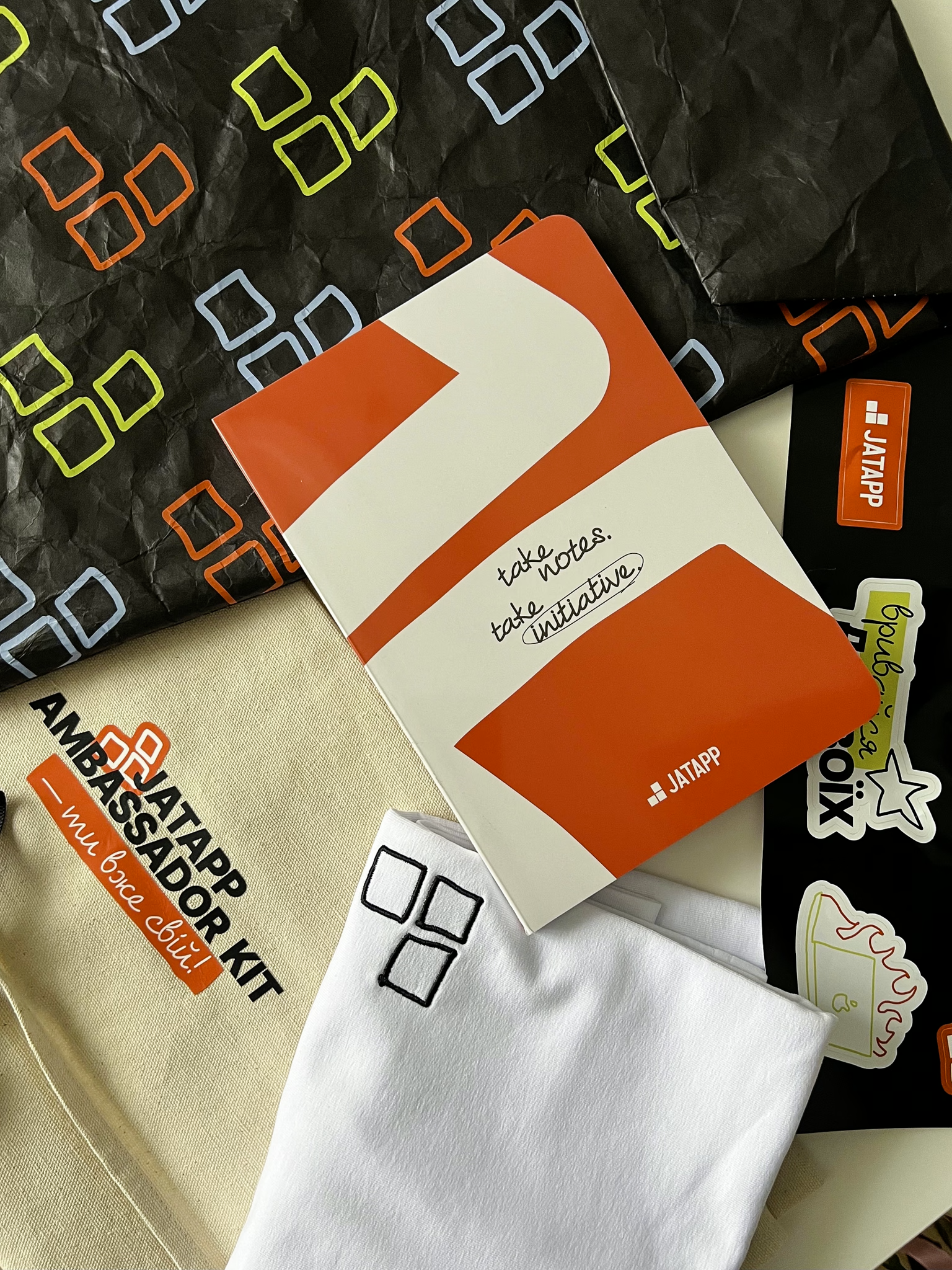
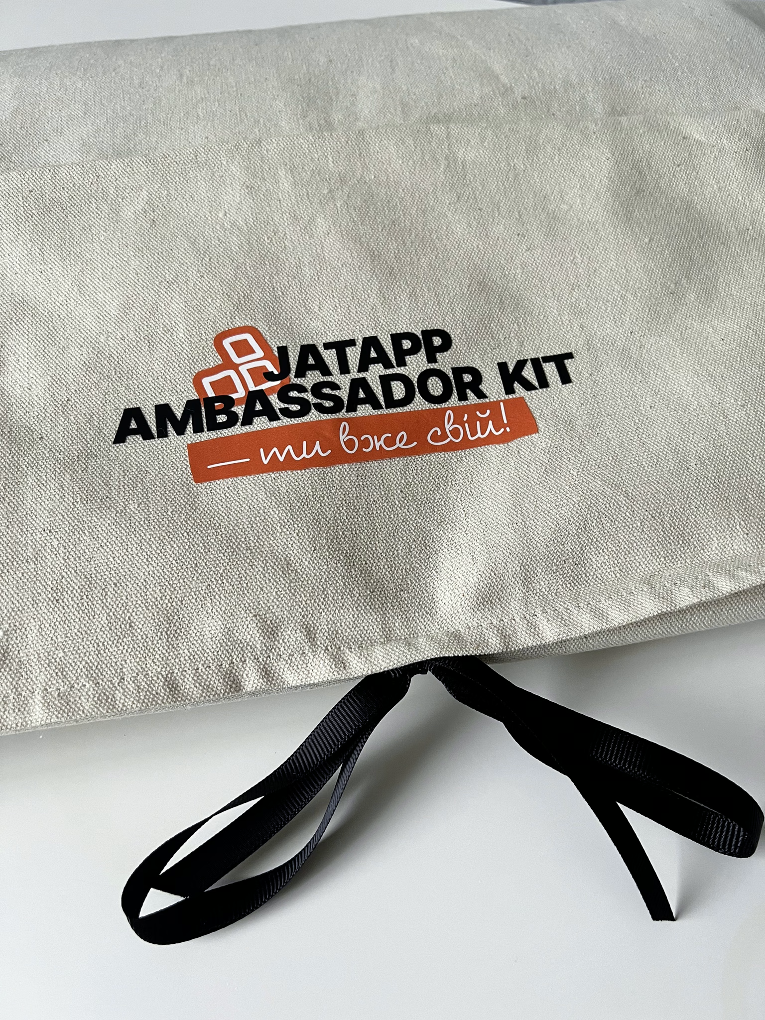
The JATAPP team brought the overall approach to merch to life. The “you’re already one of us!” ambassador kit brought the system together in one set: a canvas tote with the logo, a T-shirt with the hand-drawn mark, a “take notes, take initiative” notebook, a sticker pack with memes and “one of us” phrases, and packaging with a square pattern.
Launching the EVP Visual Identity Inside JATAPP
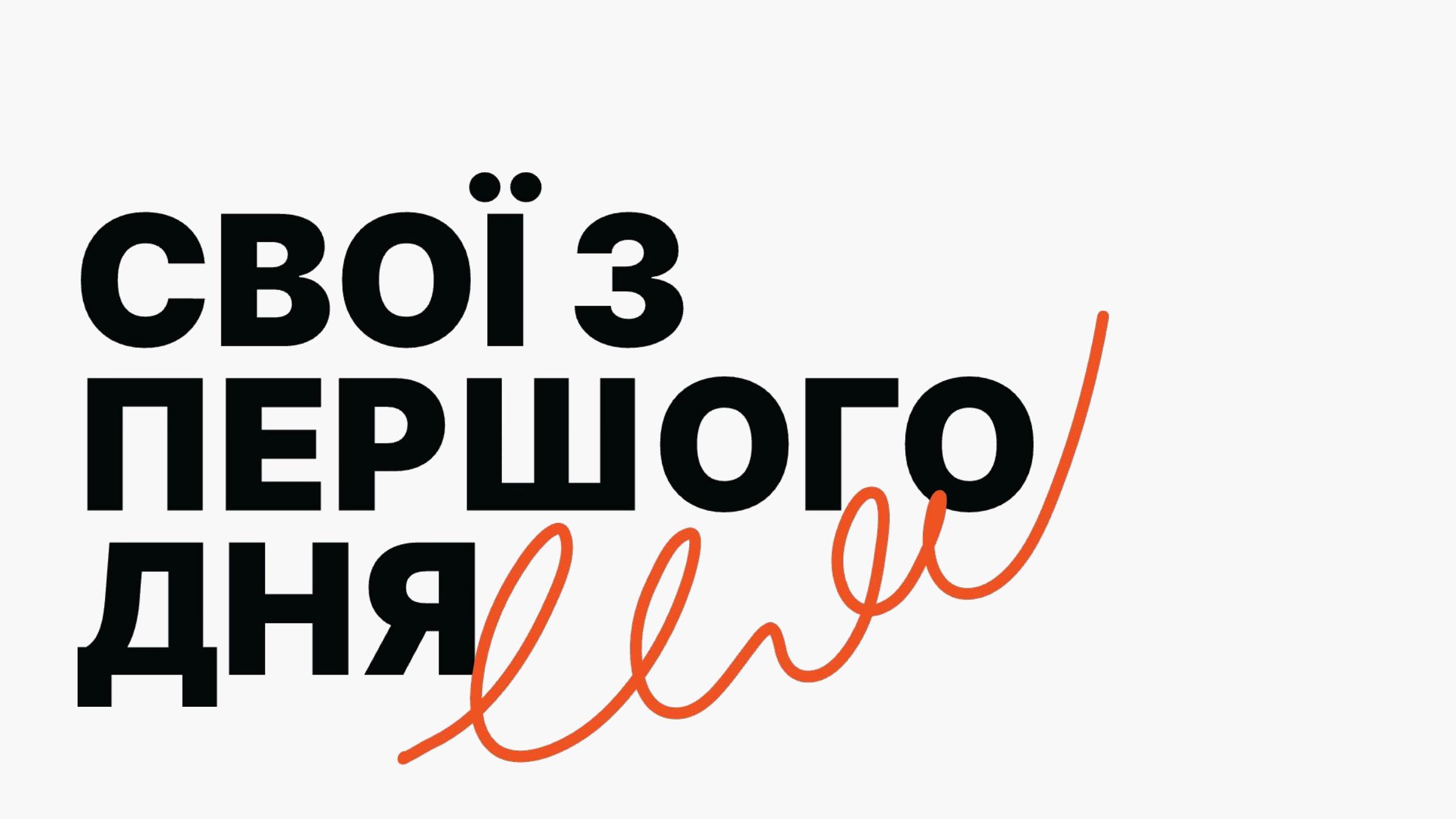
JATAPP presented the new EVP to the whole team — already in the new visual language. The presentation became the first major expression of the system inside the company.
The Outcome: A Visual System Built for Co-Creation
Co-Creation Lineup
A Visual Language That Grows from Strategy